Your ability to write ads, landing pages, or emails that make readers take action – whether it’s to buy something, download an eBook, join your email list, or something else – is one of the keys to becoming a successful marketer.
While it’s one thing to write headlines or introductions that hook a reader, it’s an entirely different ball game to make these readers take action after reading your copy. To make your audience or readers take action, you need to pay more than the usual attention to creating a compelling call to action (CTA).
We’re going to share real-life examples of CTAs you can use to improve your conversions and grow your business. You’ll also learn why you need a strong call to action and how to write CTAs that work.
A call to action is used to prompt an audience to take a specific action.
When you think about the last time you downloaded an eBook, enrolled for an email course, or signed up for a software’s free trial, you will discover that a CTA was the final nudge that made you take action.
Common examples of CTAs you can find on websites, landing pages, emails, and ads are “Buy now,” “Subscribe,” “Sign Up,” and “Learn More”. These CTAs serve as a bridge between your audience and conversion.
Why should you create a strong call to action?
Many marketers make the mistake of thinking that CTAs are not necessary, especially since a call to action only takes up a small part of their website, email, or landing page. They also imagine that slapping common CTA examples like “Buy Now” or “Subscribe” on their copy would convert well for them.
But the truth is that your conversions would tank if you don’t create strong CTAs. Why? The average daily time spent on social media in 2020 was 145 minutes compared to only 111 minutes in 2015 – meaning people now consume more content than ever before. As a marketer, this means you’re literally in direct competition for people’s attention against Zoom calls, TikTok, Netflix, Instagram, and other social platforms.
In a world where attention spans are lower because of the many content and information channels available today, you’d be doing a disservice to your readers if you don’t use strong CTAs. A good CTA should grab people’s attention, make them notice what they stand to gain, and prompt them to take action.
So how can you create a strong call to action? First, you need to set the right foundation.
Before you write a CTA
No builder sets out to build a house without having a plan or laying the foundation. Similarly, you need to set the foundation for your CTAs before you begin writing.
Here are two questions that can help you lay the groundwork:
- What is your goal?
- Who is your audience?
What is your goal?
When writing CTAs, start with an end goal in mind. What action do you want your audience to take? Do you want them to sign up for your newsletter? Book a demo? Buy your products?
Whatever the goal is, it should be specific and straightforward. Don’t bombard your audience with too many options at once. Offering several choices confuses the audience and hurts your conversion rate opportunity.
Who is your audience?
Knowing your audience goes deeper than creating a random “Marketing Mary” persona. You need to understand your audience’s fears and desires well. Once you’ve identified who your audience is and what you want them to do, it’s time to start writing your CTA.
Best practices for creating CTAs that work
While there are no set or rigid rules when creating CTAs, a few principles can help you write strong CTAs. These principles work whether you’re writing a call to action for your websites, ads, social media captions, or emails.
Keep your CTA above the fold
A fold is the part of your website that visitors see before they start scrolling.
It’d be a waste of website real estate to hide your call to action in a place other than the first part of your website that visitors see. You can still use images, logos, and other graphics along with your CTA above the fold.
Don’t just tell people to do something
In 1978, Harvard professor Ellen Langer carried out a study that showed the power of using the word “because”. The study was conducted in front of a busy copy machine on the Harvard College campus.
Participants were asked to try to skip the queue using three different pitches:
- “Excuse me. I have five pages. May I use the xerox machine?”
- “Excuse me. I have five pages. May I use the xerox machine because I’m in a rush?”
- “Excuse me. I have five pages. May I use the xerox machine because I have to make copies?”
The results?
The first statement without “because” got a 60% favorable response. But that response was dwarfed by the 94% and 93% favorable responses from the other two pitches that used “because”.
Instead of just telling people to do something, tell them why they should do it.
Use a call to value instead of a call to action
Like telling your audience why they should do something, a call to value helps hammer on the benefits your audience can get from taking a particular action. Don’t say “Shop now” when you could say “Shop now and get 30% off of your order.”
Create a sense of urgency
Remember how you always rushed your assignment the night before you had to submit it? Without a submission deadline, you probably wouldn’t have completed as many assignments as you did in high school. The same thing happens with your marketing messages.
Without a sense of urgency, your audience would most likely not take any form of action. To create a sense of urgency, you can use phrases like “limited offer,” “now,” “XXX seats left” in your CTAs.
Your CTA should also make your audience fear that they’ll miss out on something if they don’t act quickly.
Strike a balance between creativity and simplicity
Don’t try to be too smart or witty by using phrases or words your audience doesn’t know. Nobody is going to hand you a medal for lacing your call to action and messaging with big words. Instead, use words, phrases, and terms that your audience uses in their daily conversations.
Use power words and phrases
A compelling call to action uses powerful words and phrases. Here’s a list of powerful words and phrases you can use in your CTA:
- Free
- Bonanza
- Discount
- Deadline
- Now
- Instantly
- Miss out
- Limited
- Crazy
- Freebie
- On-demand
- Odd
- Seize
- Grab
- Try for free
- Start your free trial
Adjust CTAs to different devices
The way your call to action appears on a mobile phone differs from how it appears on a desktop. Make sure you optimize your CTA buttons to match the different devices your audience uses.
Employ social proof
Social proof, no matter how small, goes a long way into making your CTAs work. In a world where everyone claims to be the best, social proof helps your audience see that you’re not the one tooting your horn.
Social proof could be in the form of big company or client logos, star ratings from review sites, testimonials from customers, or some stats like the number of email subscribers you have.
Consider your CTA length
No rule book says that your CTA needs to be a specific length. The length of your call to action often depends on your offer and understanding of your audience. So don’t sweat it. Besides, you can always test which length works best for you.
Always keep testing
One exciting thing about CTAs is that you can test almost everything about them to see what works. You can test your call to action’s copy, button, button size, placement, and even the colors using an effective CTA conversion strategy.
15 call-to-action examples to draw inspiration from
You don’t always have to start from scratch or reinvent the wheel when creating a call to action. Here are some CTA examples that can inspire you, spanning across website, email, landing page, and ad CTA examples.
1. Get a free savings assessment
Even though G2’s homepage has a couple of good CTAs, the one on the header navigation bar stands out for many reasons.

First, it catches the eye immediately because its color scheme contrasts with the background and the rest of the page. It also contains the word “Free,” a word everyone loves to hear.
The use of figures and a clear benefit in the “Reduce your software costs by 18% overnight” line also makes clicking the CTA a no-brainer.
2. Start a 7-day trial for $7
Customers want to know what they’ll be getting before they click anything on your site. Ahrefs could have conveniently made their CTA read “Start a 7-day trial” without mentioning the $7 part.
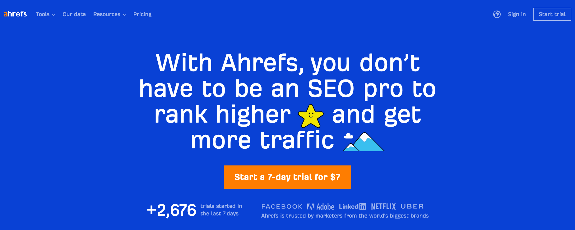
While this can cause more visitors to click on the CTA, only a small percentage of them would proceed after hitting a paywall. If your audience has to pay before using your tool, clarify it in the call to action.
3. Learn more
“Learn more” is one of the most common CTAs on websites. While it may not work for everyone, it works well for Apple…well, because they’re Apple. Since they’re already on top of their audiences’ minds, Apple doesn’t need to say much to move people to action.

You’d also notice that although the call to action isn’t a button, it’s still easily identifiable because its color differs from the rest of the text.
4. Plant now
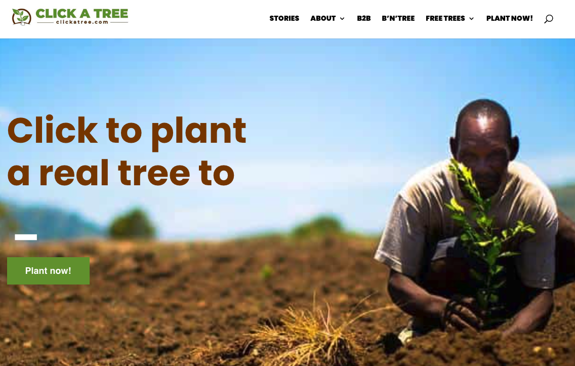
Click A Tree’s website design looks clean and on-brand. The image choice clearly shows what the organization is all about. The use of brown (earth) and green (leaves) as their colors also points to the organization’s mission to plant more trees.
All these elements combine to make the “Plant now” CTA work. “Now” also creates a sense of urgency.
5. Get started – it’s free
Many company websites, especially SaaS companies, use the “Get started” CTA. However, Webflow takes it a step further by adding “ it’s free” at the end of their CTA.
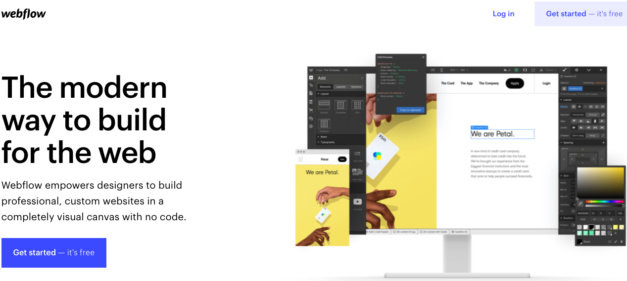
This little addition helps resolve some objections around pricing that may come up in a visitor’s mind.
6. See how addictive email can be
Over the years, Tarzan Kay has built a successful business through email marketing. And with her website headline, she shows visitors what they would get when they click the CTA button.
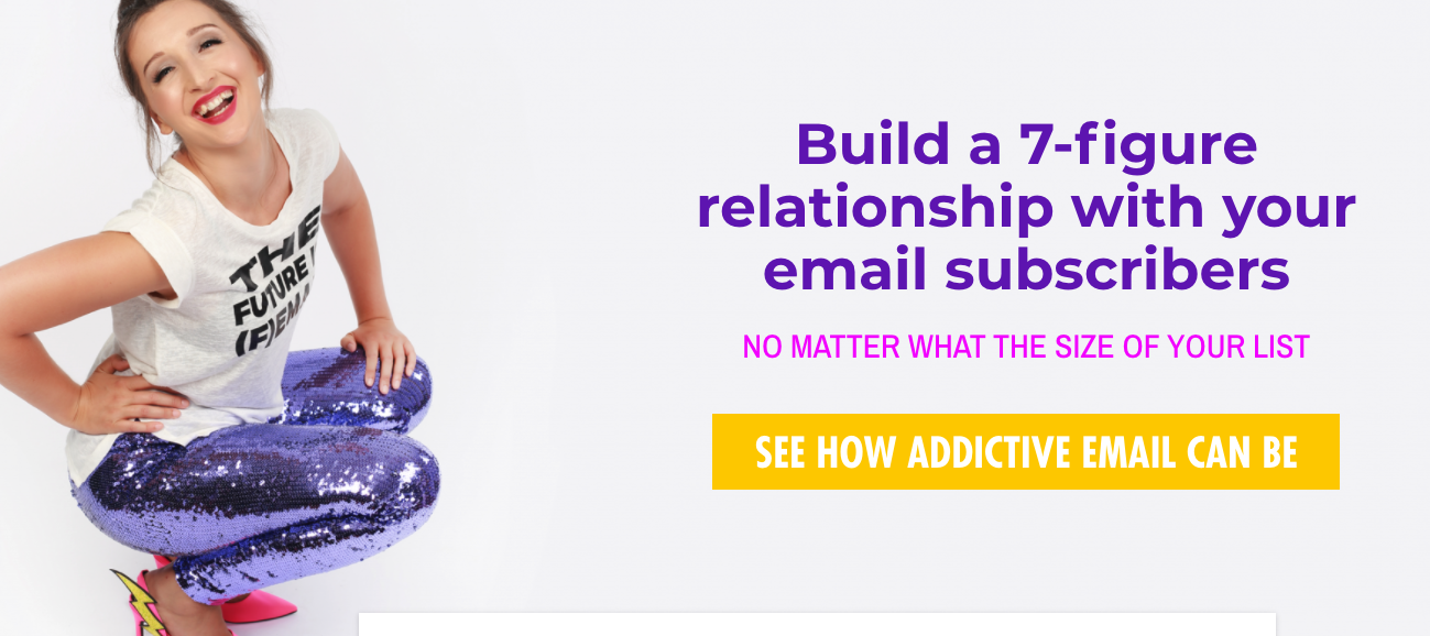
Yes, that giant CTA button. Although the button hard to miss, it’s not pushy or salesy. Instead, it gives visitors the feeling that they would be gaining front seat rows to see how email marketing can work for them.
7. Get 30 days free
Want to know what’s better than getting a week-long free trial? Getting 30 days free.
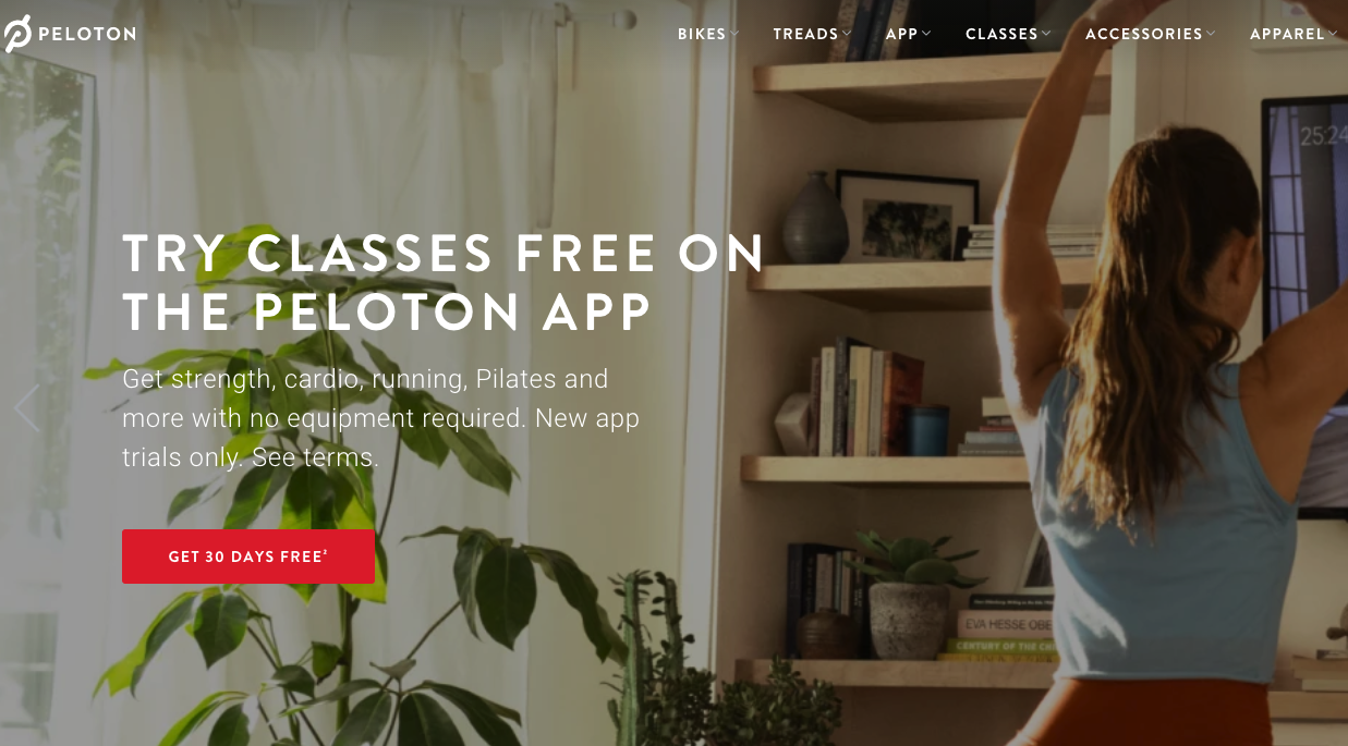
Peloton uses the “Get 30 days free” CTA to attract and convert visitors who want to get fit. This CTA is excellent because 30 days is more than enough time for a person to tell whether Peleton’s program is working for them or not.
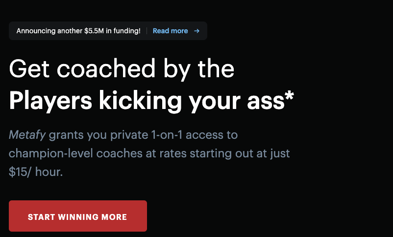
8. Start winning more
It’s not only in your homepage headline that you can highlight your products or services’ most significant benefits. You can and should use these benefits in your call-to-action copy too. Winning is something anyone who plays games wants to achieve. And Metafy here brilliantly highlights this with their “Start winning more” CTA.
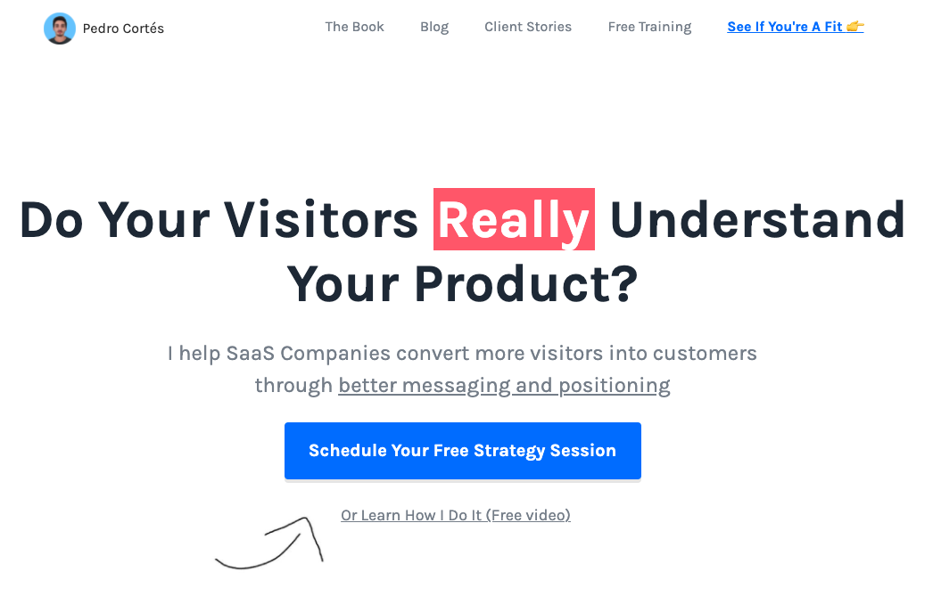
9. Schedule your free strategy session
Like we mentioned earlier, knowing your audience is vital to writing strong CTAs. Here, Pedro clearly defines that he serves SaaS companies that have trouble converting visitors into customers.
SaaS business owners know that a small percentage change (say 5% uptick) in their conversions can blow their revenue out of the water. Pedro knows this too, and that’s why his CTA offering a free strategy session (emphasis on free) looks like a steal.
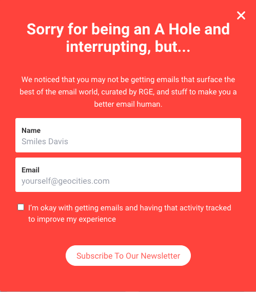
10. Subscribe to our newsletter
Let’s start with the classic “Subscribe to our newsletter”.
Although many companies have email sign-up boxes that use this CTA, these companies often offer zero motivation to make their audience actually subscribe. Really Good Emails gives their visitors compelling reasons why they should subscribe to their email list.
11. Start saving
Black Friday deals come and go every year, and almost everyone with an email gets bombarded by deals from different companies.
To help their customers make the most of these deals, Bluehost uses a simple “Start saving” CTA. This call to action works because it offers a clear benefit. Thanks to the button’s deep blue color on a lighter background, it’s also hard to miss.
12. Go pro yearly and save 45%
Many customers would rather pay $10 monthly instead of $100 per year, even though the yearly subscription cost less in the long run.
In this email CTA example, Bannersnack not only highlights that customers would be saving 45% if they move to a yearly subscription. But they also mention other benefits like “No more missed payment” and “no more worries”.
13. Start streaming
HBOmax is a video streaming platform. And it’s only right that they use a “Start streaming” CTA in their emails.
While the CTA is not super creative, they did make it stand out by using different colors for the CTA button and the background.
14. Get more time
ClickUp is a time and project management tool for big and small businesses.
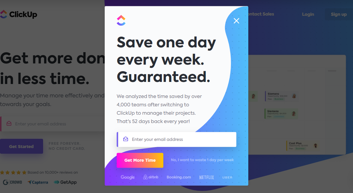
Their email pop-up box decided to ditch the traditional “join our newsletter” and use “Get more time” instead.
Why does this work? Anyone interested in gaining back more time would be interested in the “Get more time” CTA. Besides bringing their value upfront, ClickUp also uses social proof (by displaying company logos) and a cheeky “No, I want to waste one day per week” line beside their call to action.
15. Start creating
In this email, Vimeo announces its new features that allow users to create and showcase videos online.
Instead of focusing on themselves, Vimeo used a CTA that focuses on the reason why people use Vimeo in the first place: to create.
Conclusion
It’s time to get to work, now that you’ve seen CTA examples that can inspire you to create a call to action that converts more of your audience into leads and customers.
Before you write, keep in mind to know your audience well and the specific action you want them to take. Your CTAs should be above the fold, start with powerful words, create a sense of urgency, have some form of social proof, and tell people why they need to take action.
