Google TV offers a lot when it comes to content discovery and aggregation, and it even has a slick modern design, too. However, there’s definitely room for improvement in some places. Here are a few tweaks we’d love to see on Google TV in the future.
Stop minimizing apps
One of the biggest selling points of Google TV is the ability to quickly find content, most times without even opening up a streaming app. However, recent changes make it feel like that’s all the platform cares about.
In a recent, near-silent update, Google TV minimized the size of app icons on the primary “For You” tab. It doesn’t really hurt anything functionally, but it does send a clear message. Google wants people using watchlist and other discovery features. There are a couple of big issues with this approach, though.
First, there’s simple app support. Google TV has a limited list of services that it deeply integrates with, and that skips content people watch on Plex, Vudu, and countless other services, including ones that have just debuted like Discovery+. By putting all of its cards on recommendations and aggregation, Google TV essentially says that these users aren’t as important.

The bigger issue with this approach is how it will affect partners going forward. Android TV and Google TV benefitted greatly this year when HBO Max and Peacock launched on the Play Store while being heavily delayed on Fire TV and Roku. Why were they delayed on other platforms? Essentially, it boils down to greed. The platforms wanted more and so did the providers. It took months to find a compromise. Google, thankfully, isn’t in the same boat, but pushing so heavily to take users out of streaming apps and to just use Google’s own search might sour some relationships. This isn’t something we’re just assuming, either – it’s already been proven as Netflix ripped itself out of most of Google’s features within a couple of months of the new Chromecast’s release. I bet they won’t be the last, either. It’s a crying shame, and Google needs to tread lightly. The discovery and watchlist features of Google TV are spectacular, but putting too much emphasis on them could lead to partners ruining them.
Redesign the Library tab
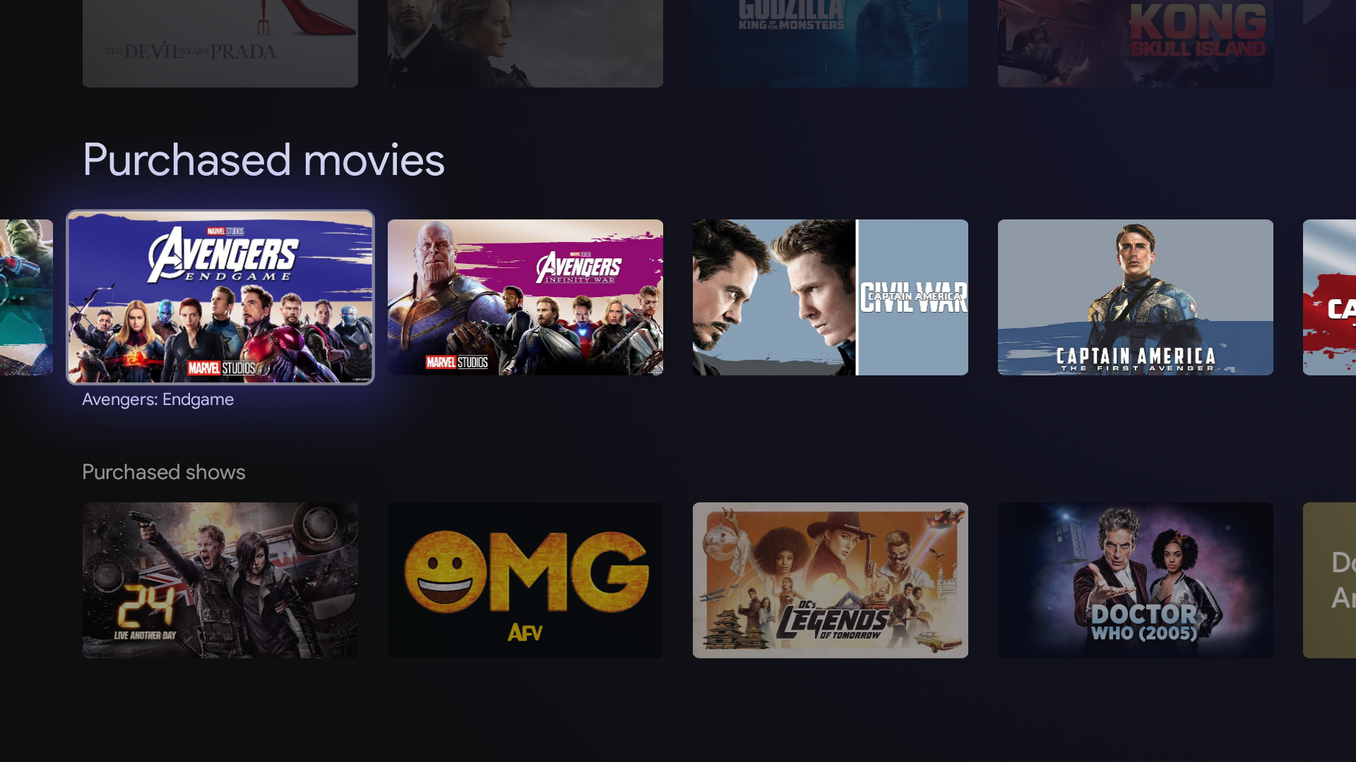
Perhaps the most annoying thing about Google TV is how it handles content you’ve purchased. Google TV replaces Play Movies & TV, which is good from a branding perspective. However, it also meant directly integrating the content from Play Movies into the homescreen under a new “Library” tab. The concept here is great, but the execution is lacking.
The biggest problem with Google TV’s library tab boils down quite literally just to layout. Like apps and recommendations, all of your purchased movies and TV shows are listed horizontally. If you only have a few titles in your library, this is fine, but with anything beyond that, this layout becomes tedious. In my own case, it takes several seconds of scrolling just to get to the various Marvel movies I’ve purchased, and that’s before slowly scrolling around to dial in my selection. It’s extremely frustrating and often pushes me to just use Vudu and Movies Anywhere instead.

An easy solution to this design frustration is to just make the Library tab on Google TV swap movies and TV shows to a grid layout, with some more advanced tweaks, including filters and sorting options.
Surface the Play Store
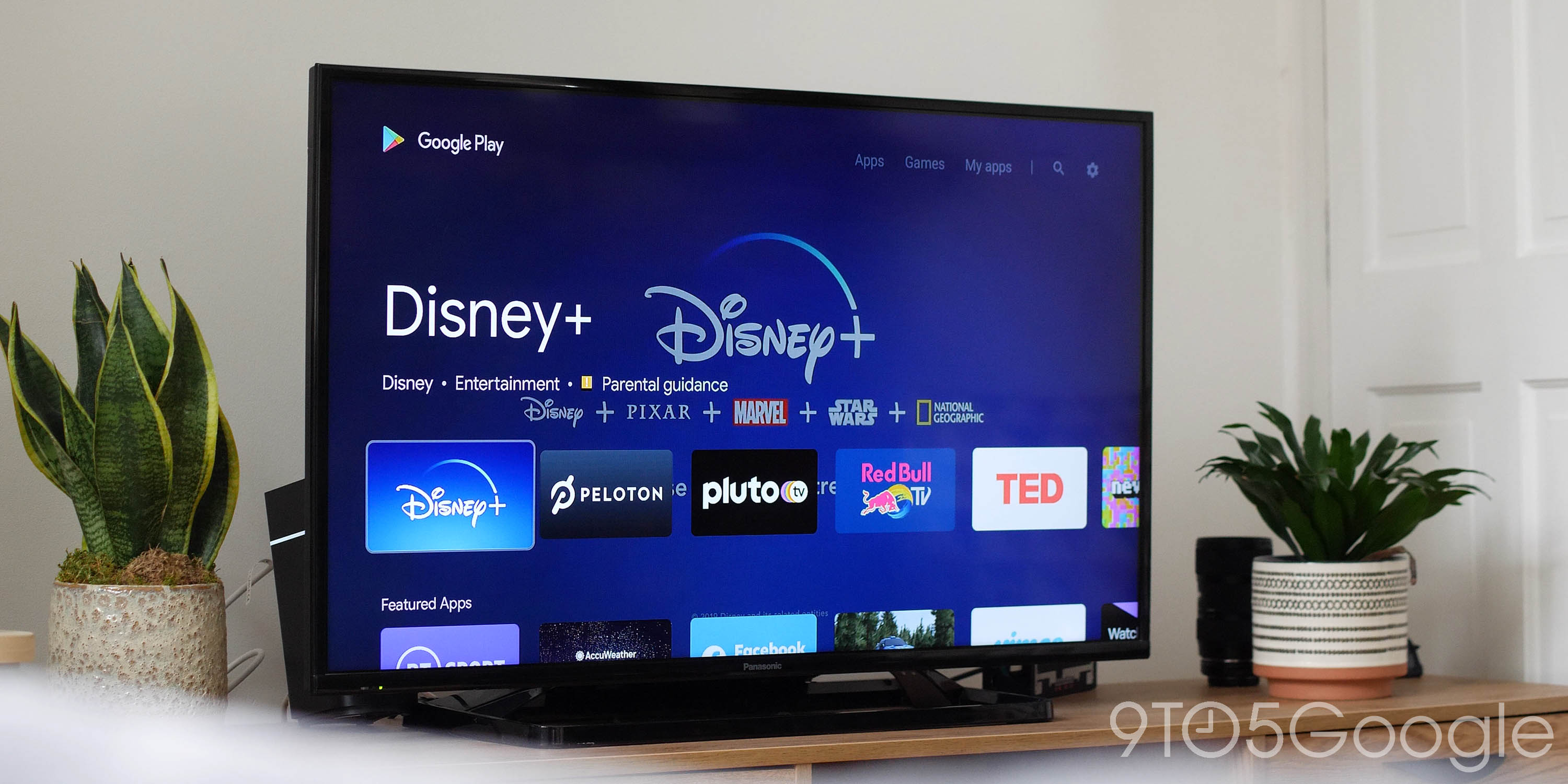
This is a minor change, but one I think Google TV really needs to make. For reasons unclear, Google buried the Play Store on this new platform, leaving it without an easy and obvious method of access. You have two options to open the full Play Store app; ask Assistant or launch it from system settings after digging through half a dozen pages. It’s just not a good experience.
The counterargument here is that the Play Store on Google TV is *technically* integrated into the homescreen. The “Apps” tab has recommendations for new apps, but that still cuts out functionality. The proper Play Store can let users manage updates and apps on their device from one location, as well as adjusting settings on auto-updates.
This move feels like a deliberate choice to fall in line with Roku and Amazon’s efforts, but it’s one that isn’t for the best. It just creates another layer of confusion that doesn’t need to exist, much less need an entire guide.

Offer some level of customization
As it stands today, Google TV has a good and easy-to-use design, but one thing I would love is *some* level of control over it. That is to say, I’d love to have just the little bit of control I had back in Android TV. The ability to move or turn off rows alone would be a major upgrade to the interface.
An example of what I’d love to do is motivated by YouTube TV. It’s great that there’s a Live TV guide integrated into the homescreen, but on the “For You” tab, I don’t want recommendations from YouTube TV on the second row. On the “Library” tab, I don’t want my DVR to show up, especially at the top. I do love Google TV’s recommendations, but I wish I could fine-tune it.
Add a clock
Ok so this is as minor as it gets, but I’ve got to mention it. I wish the Google TV homescreen had a clock that was visible at all times. As it stands, you either need to access the notification tray or wait for the screen saver to kick in. Just tossing a little clock under the “Google TV” logo or off to the right-most side would be great, and it would be an easy addition, too.
More on Google TV:
FTC: We use income earning auto affiliate links. More.

